Mjuk — A timeless identity for everyday comfort
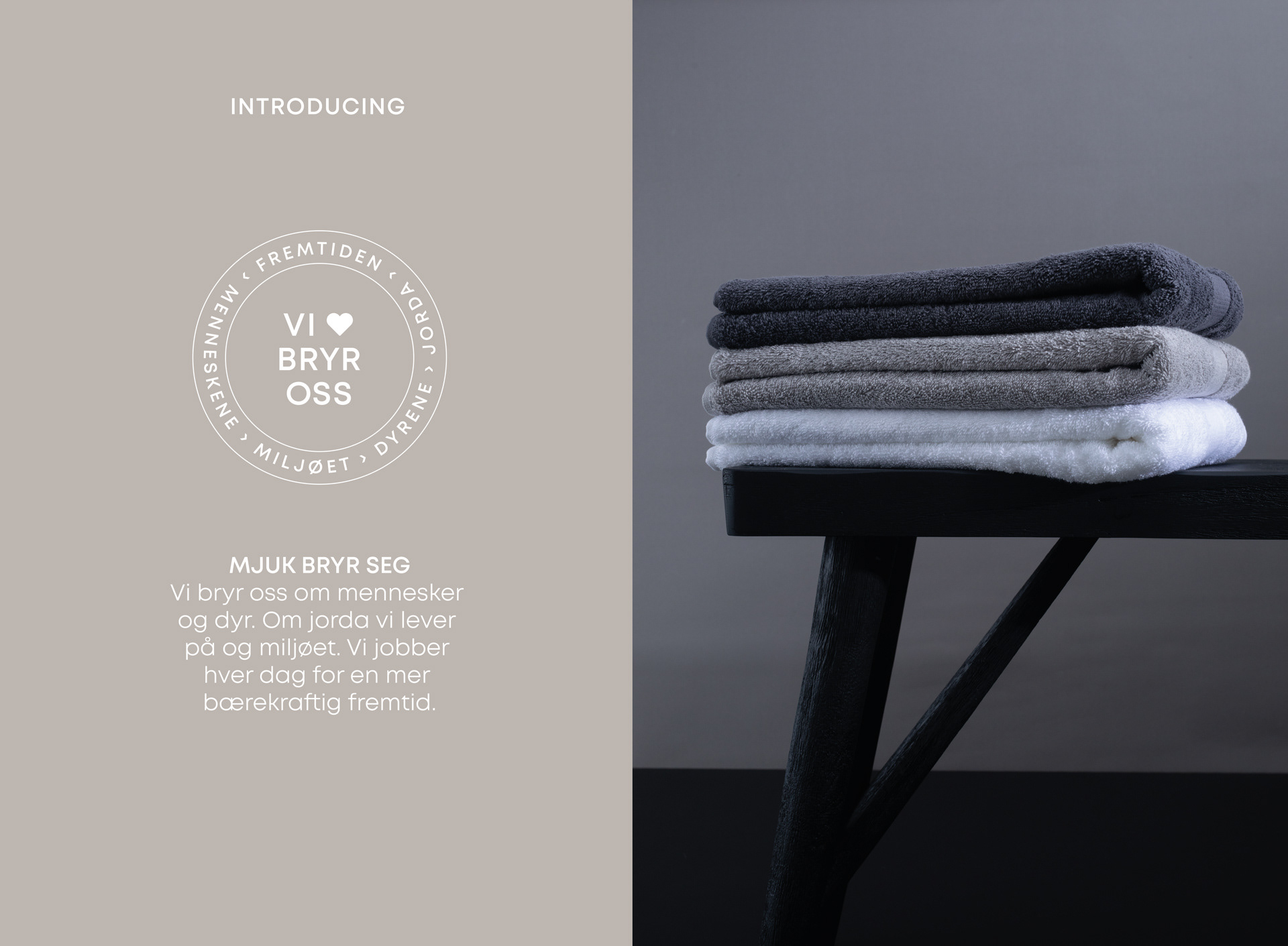
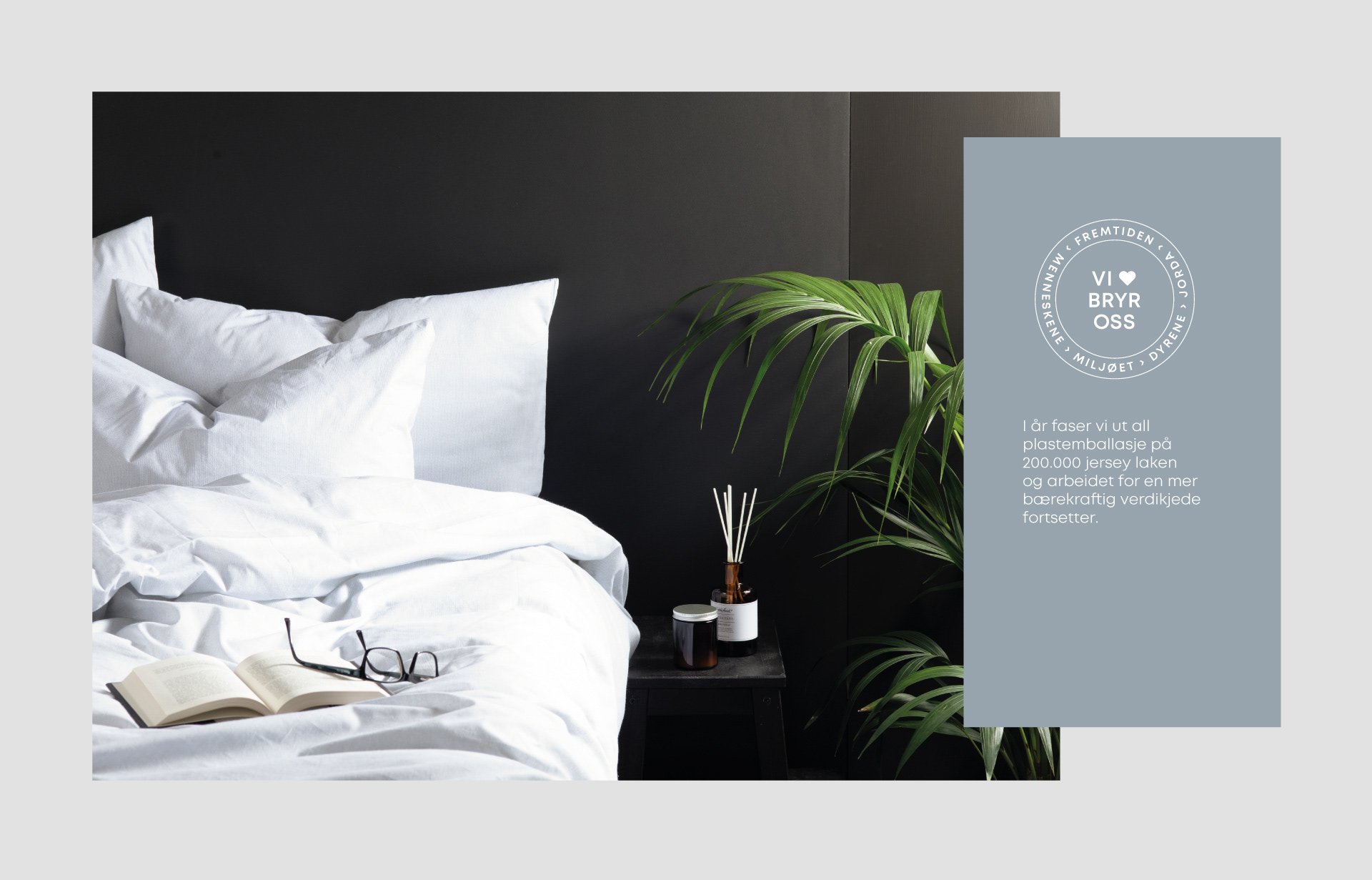
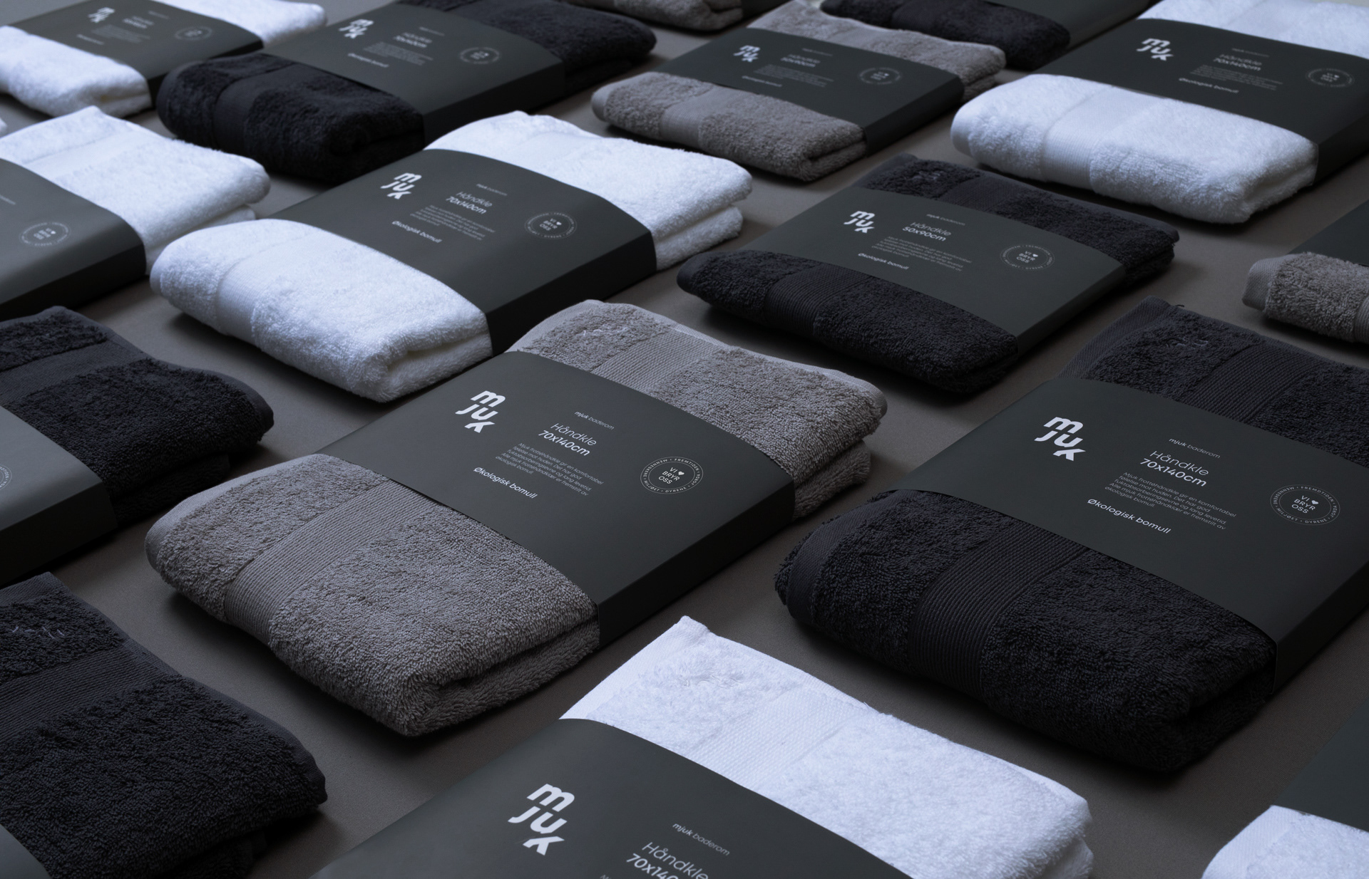
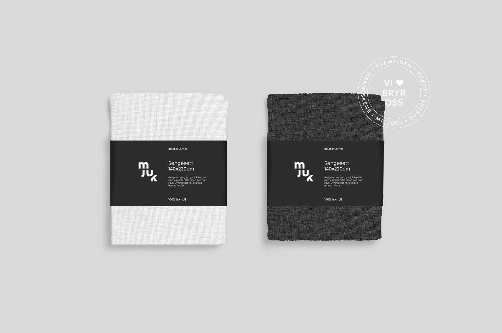
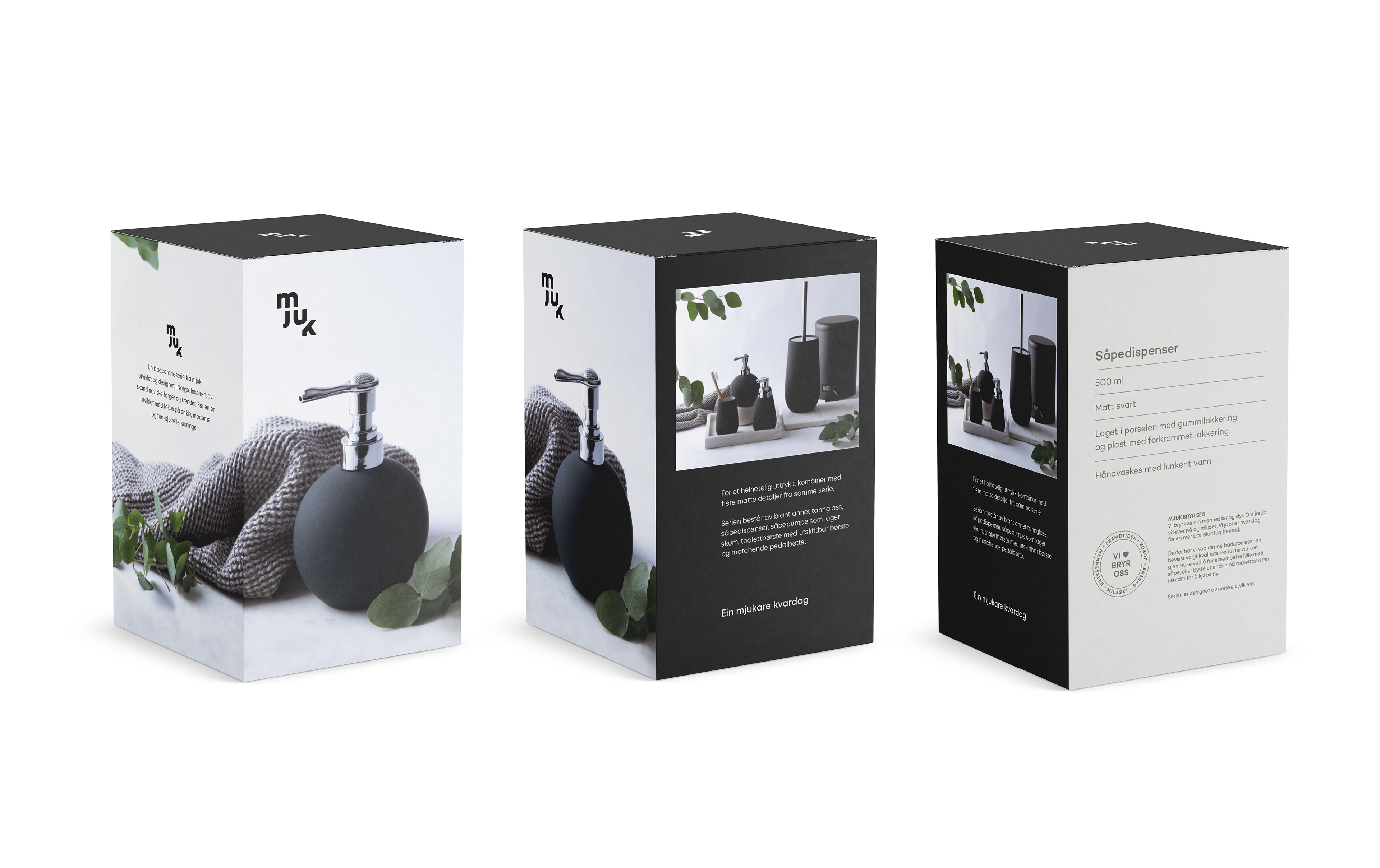
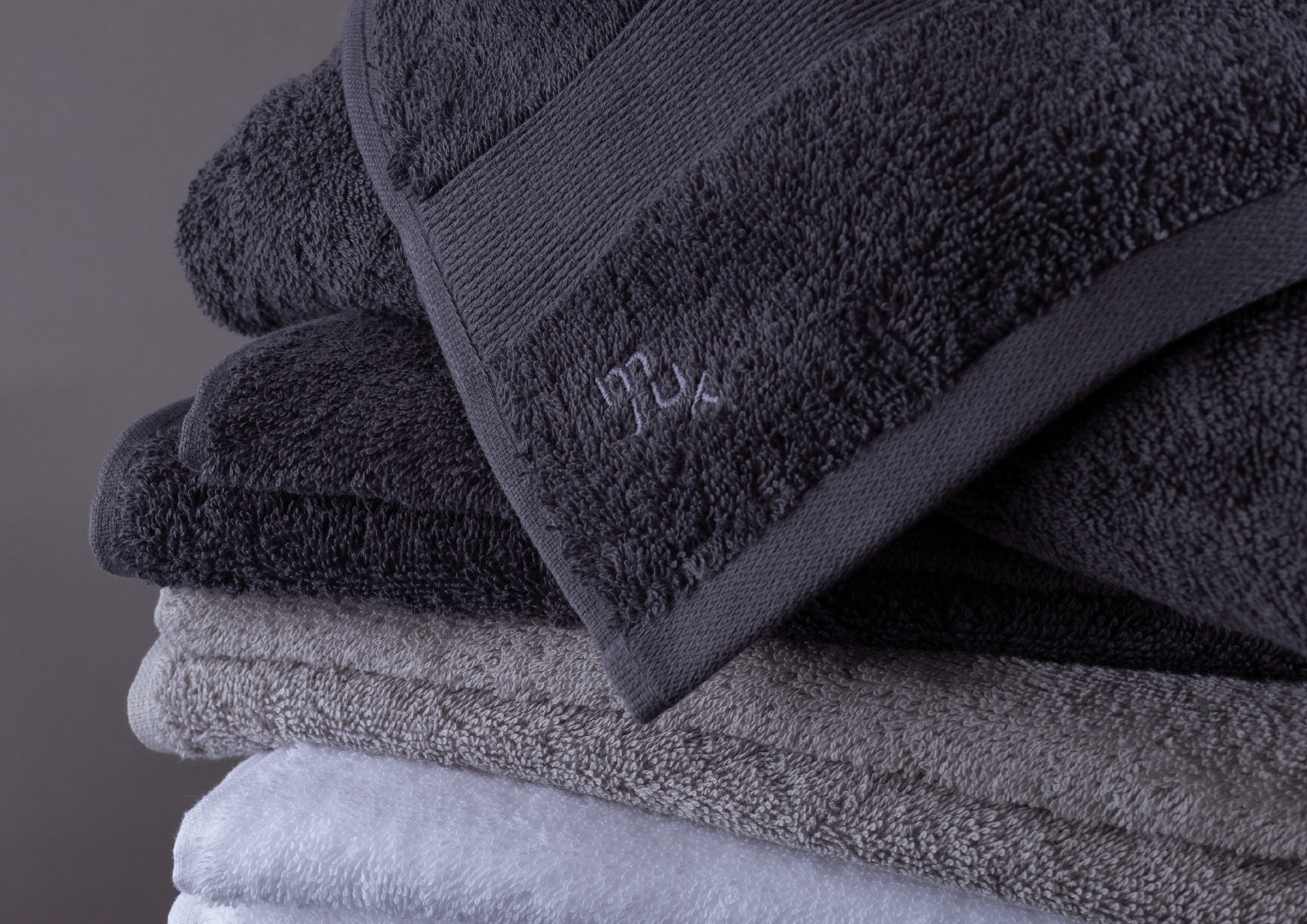
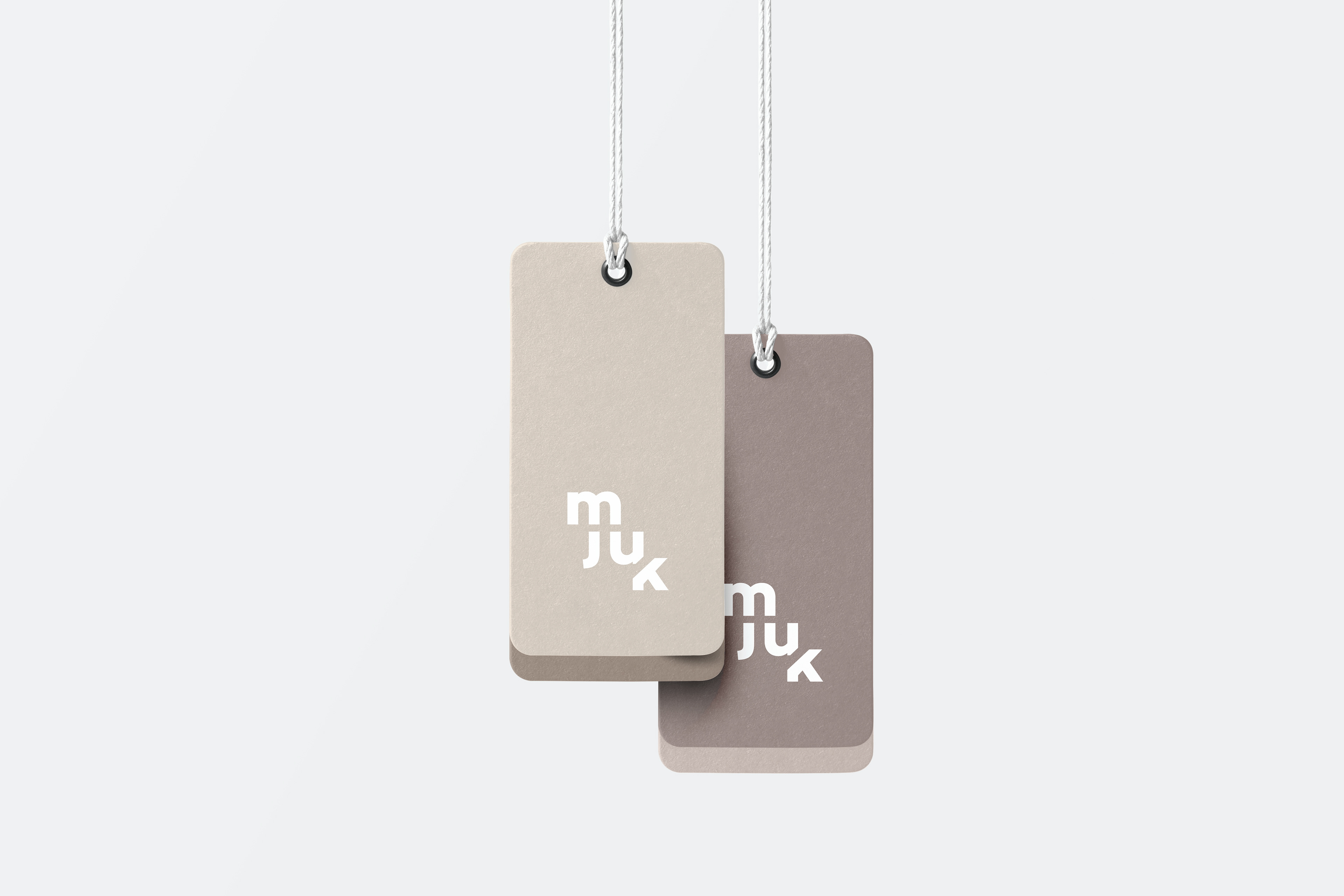
Mjuk, a home textiles brand by Coop Norway, offers affordable and thoughtfully designed products like towels, bedding, and blankets. The brand identity reflects softness and sustainability, with a clean, compact logo that can be stitched onto materials and a calming color palette that embodies comfort. We introduced the “Vi bryr oss” (We care) label to highlight sustainable efforts, such as eliminating plastic packaging on Jersey sheets, reducing waste by 200,000 pieces annually. With its minimalistic design and friendly tone, Mjuk connects deeply with Norwegian living, combining functionality, quality, and timeless aesthetics.
Project done in 2018 at Rethink Studio