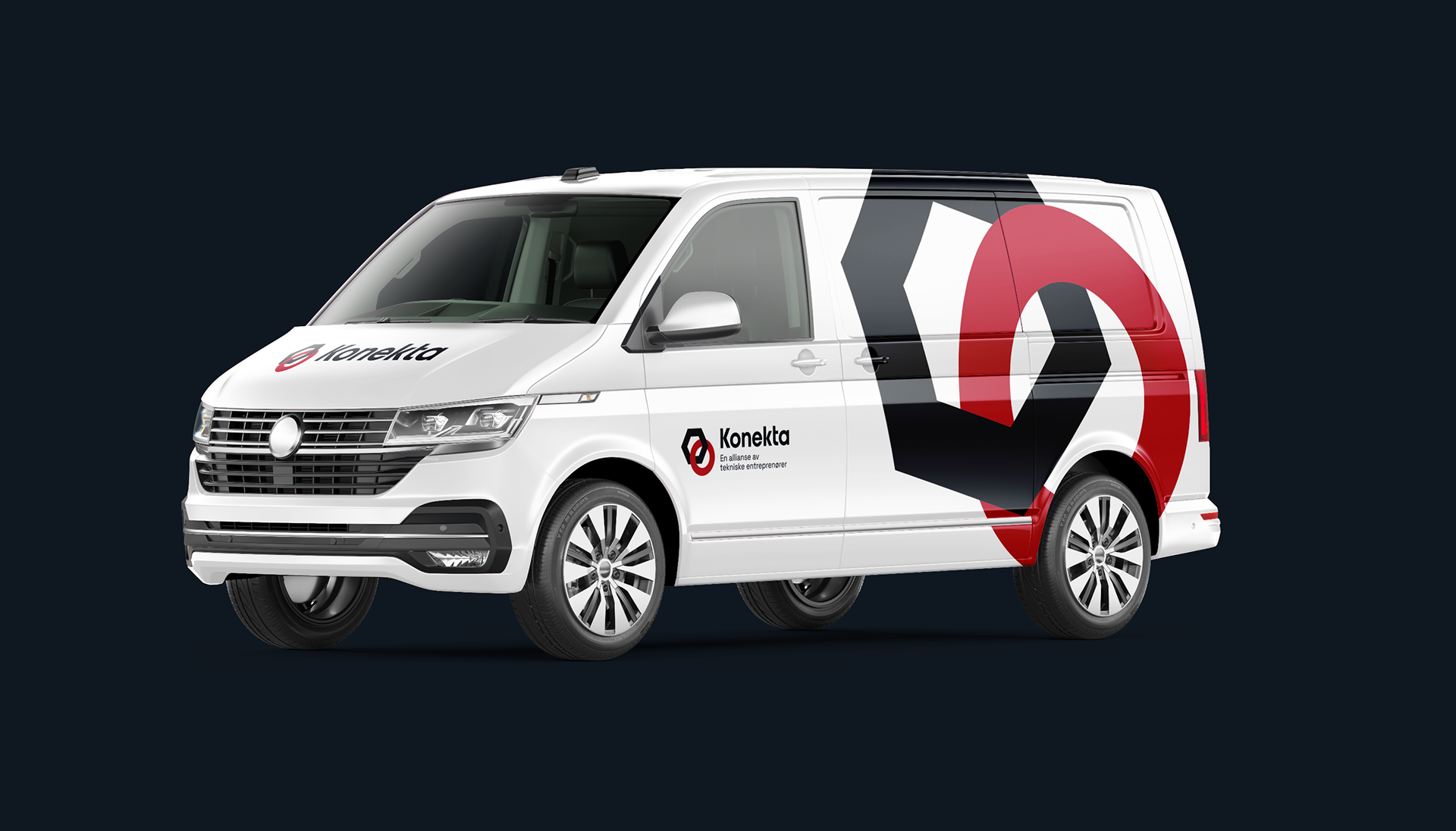
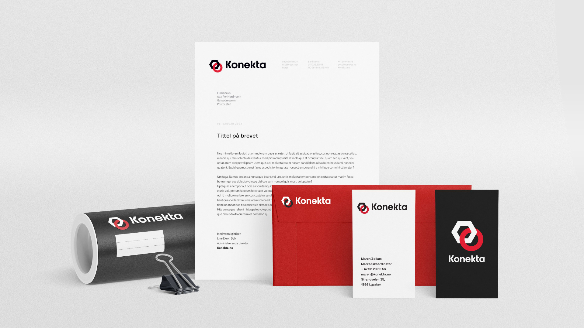
Konekta – New name and identity
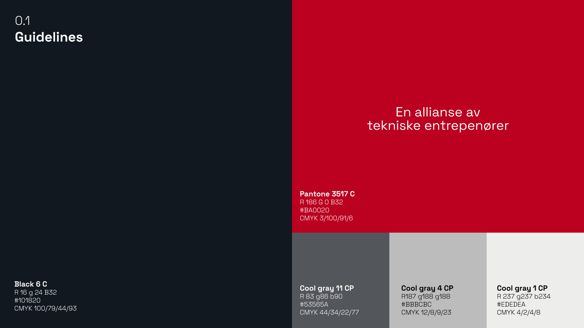
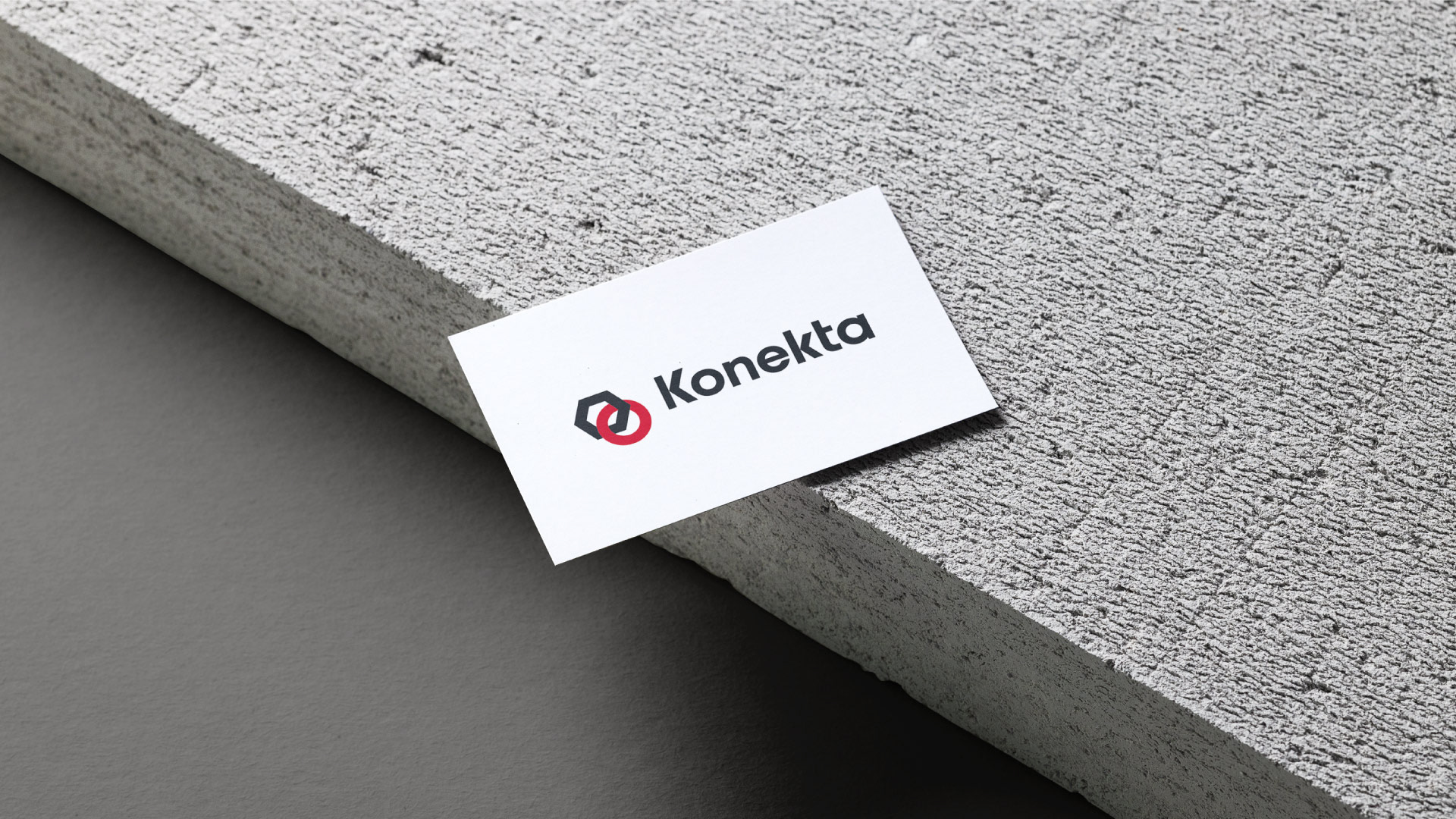
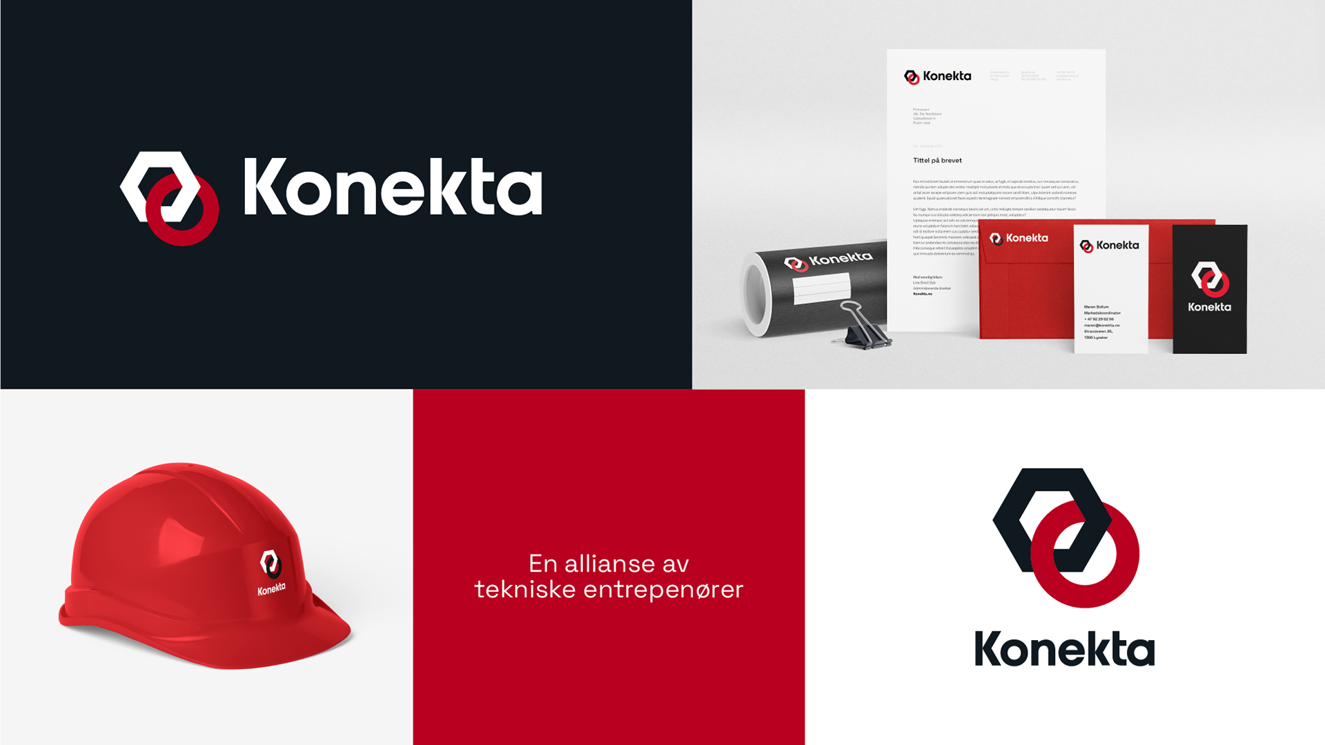
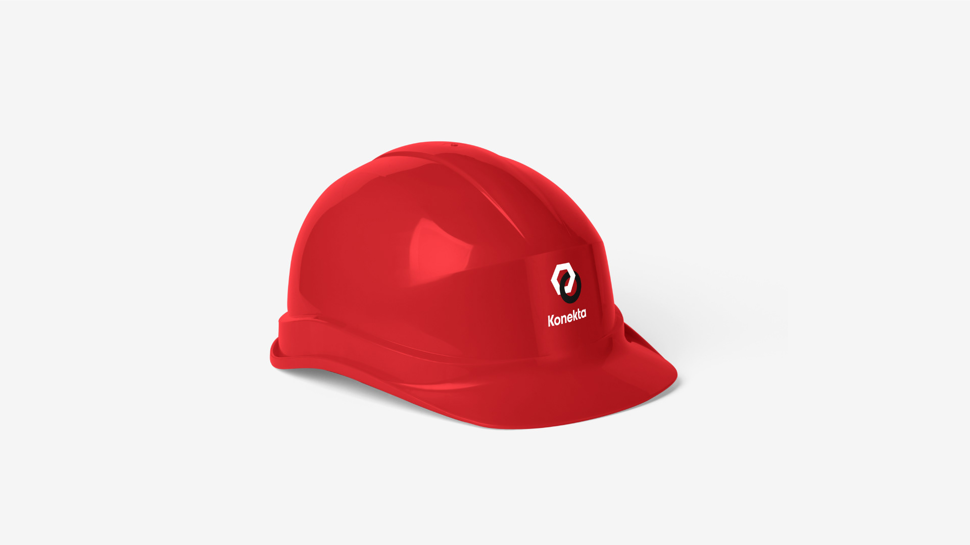
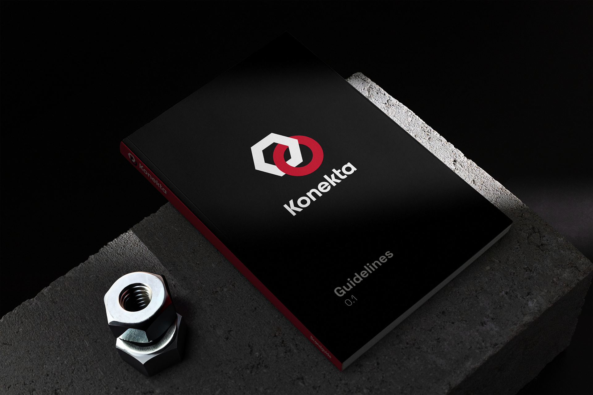
Formerly Norsk Rørallianse (NRA), Konekta is a nationwide alliance of leading technical contractor companies specializing in plumbing, electrical work, ventilation, and more. The new name was necessary to move away from the unfortunate associations with the American NRA and to reflect the company’s evolution beyond its origins in plumbing. Inspired by the idea of “connecting,” Konekta symbolizes the alliance’s strength in bringing companies, expertise, and people together. The visual identity emphasizes this connection with a logo inspired by a toolbox—a bold, industrial mark where two bolts are securely fastened together, representing strength through collaboration. The design features a masculine expression with clean lines, strong typography, and a bold color palette centered on a vibrant red, supported by black and white contrasts, perfectly suited to the industry and its target audience.
Project done at Grid Branding in 2021
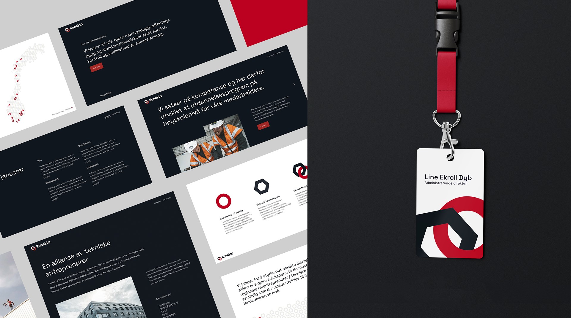
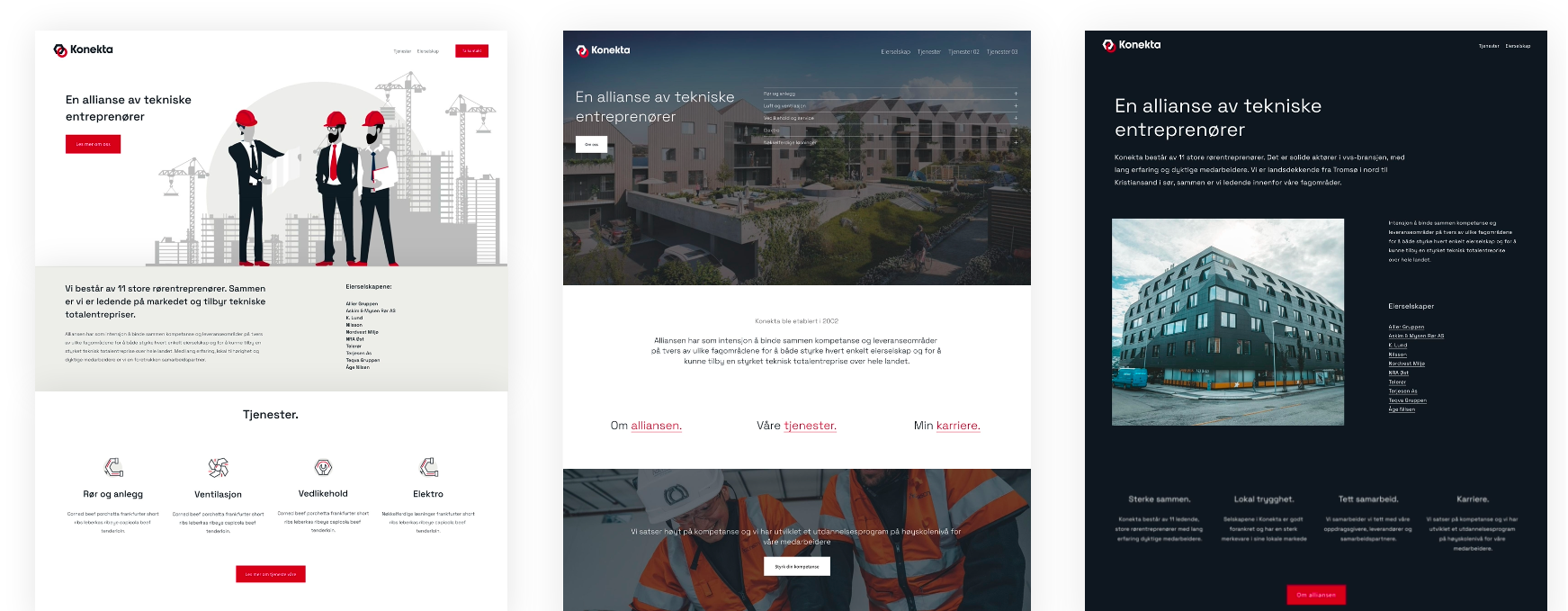
Three unused UI suggestion to their new website.