Farris - Shine bright like a diamond
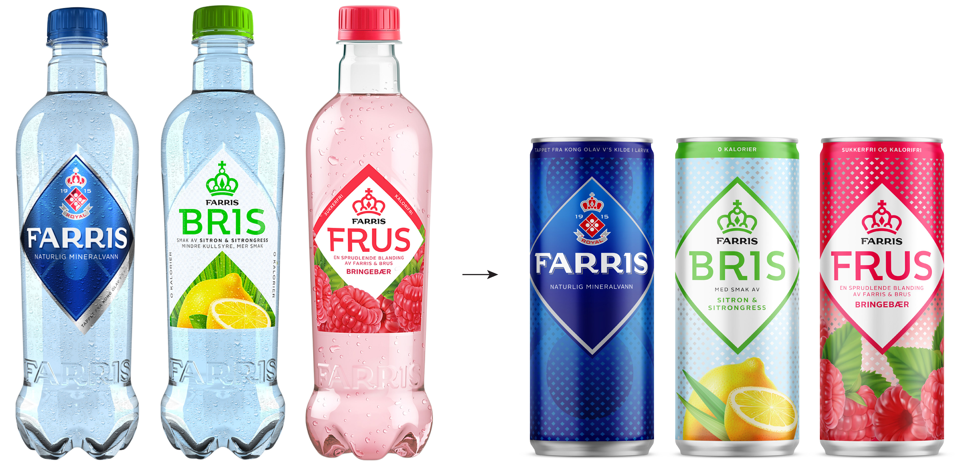
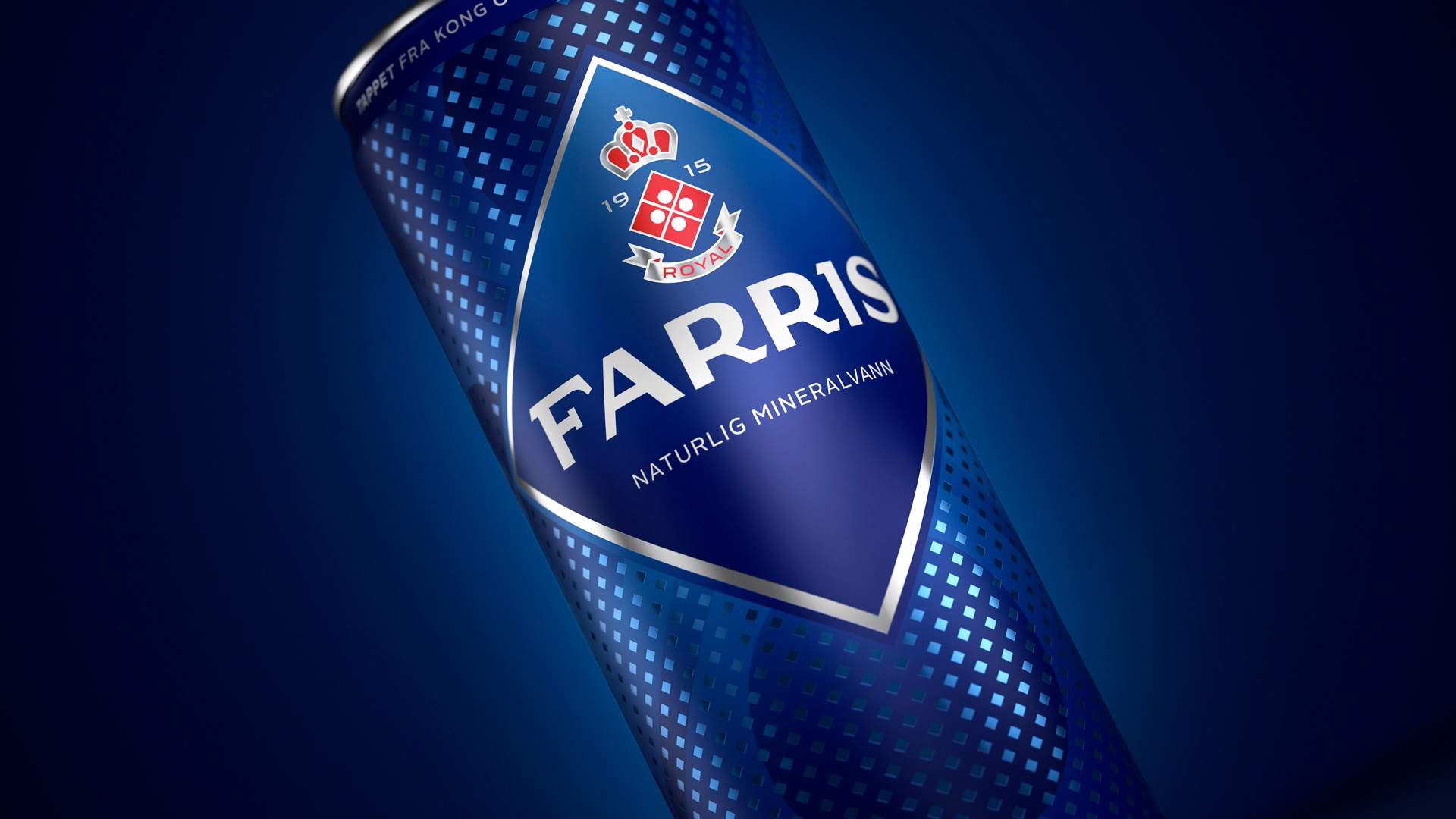
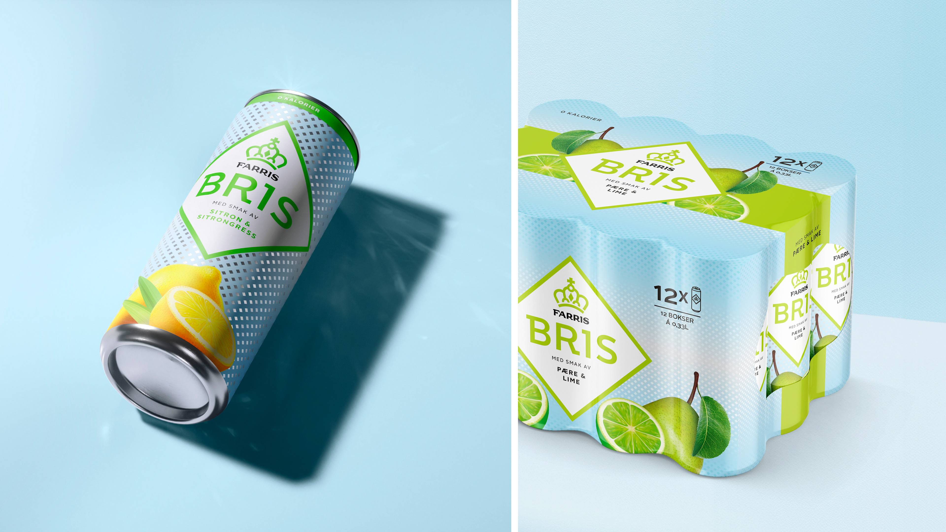
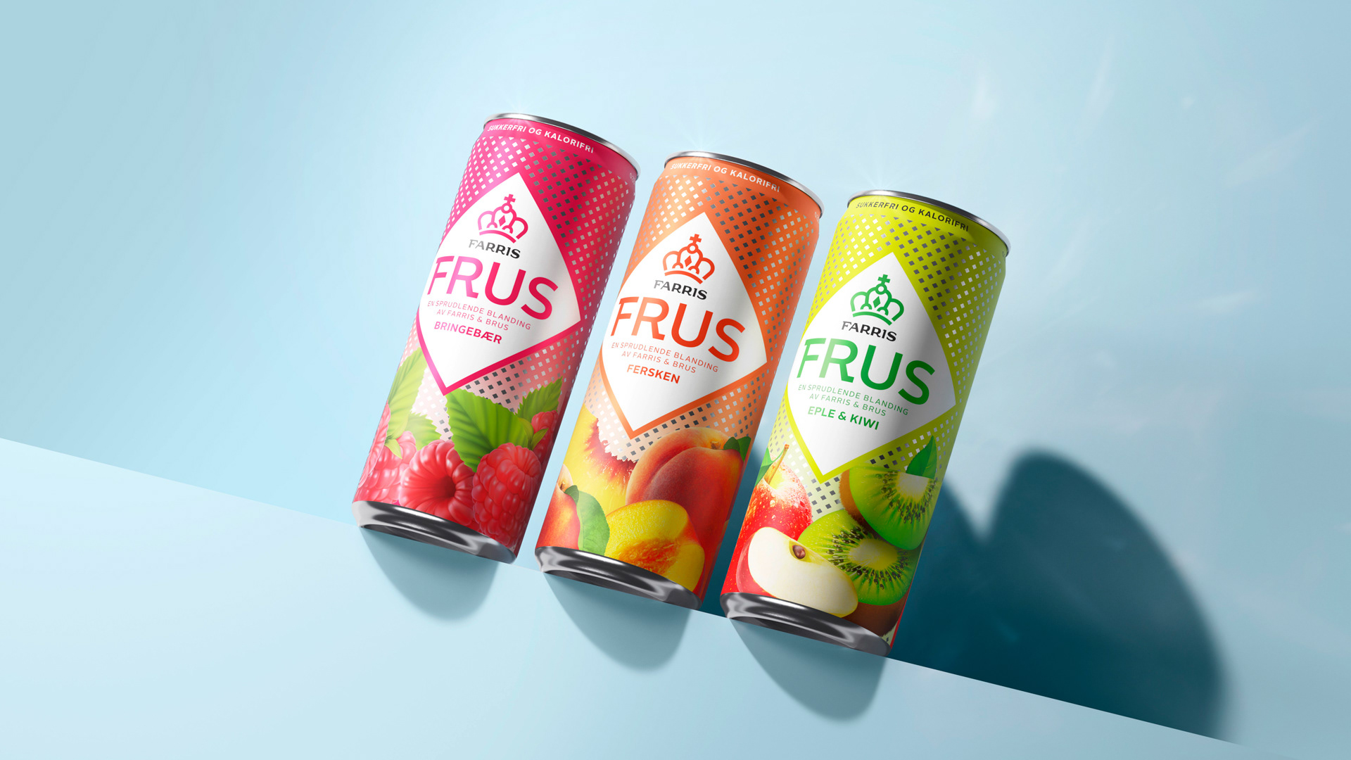
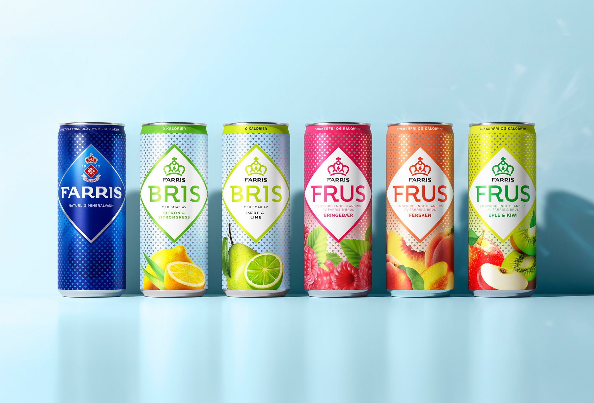
When transitioning Farris, Bris, and Frus to cans, we unified their branding by introducing consistent design elements across the portfolio. At the center is the iconic diamond shape, already a hallmark of the Farris brand, now featured across all subbrands to highlight the logo, name, and flavor. Inspired by the unique minerals from Larvik’s royal springs, we created a new pattern based on the diamond, evoking sparkling bubbles and enhancing the perception of quality. This cohesive design brings the product lines together while giving the cans a premium, unified look.
Project done at Grid Branding 2023